Heads up!
This is an outdated case study that has been minimally reformatted to fit the current site design. Expect visual inconsistencies while updates are in progress.
Smigin Mobile App (2013–2016)
Smigin was a mobile travel app that let users build and translate useful phrases without needing WiFi—something ahead of its time, before offline translation and real-time AI tools were mainstream. At its peak, Smigin reached users in 175+ countries, was ranked the #1 Education app in 13, and amassed over 85,000 downloads.
As a founding team member, I contributed to Smigin’s early growth and evolution—from content creation and UX internships to leading our post-MVP redesign and creative direction.


Client
Smigin (in-house startup)
Timeline
2013–2016
Role
Creative + Product Designer
Tools
Sketch, Photoshop, Illustrator, InVision, Premiere
Responsibilities
Information Architecture
UI Design (iOS & Android)
Wireframing & Prototyping
UX Documentation
Content & Copywriting
The Challenge
When Smigin launched its MVP, users had to rotate their phones horizontally to use the app. This, along with App Store feedback and shifting user behavior, prompted a full redesign for iOS—followed by a new Android release.
Key goals:
Support native vertical orientation
Improve navigation and phrase management
Prepare for Android launch
Enhance sharing features
I led the redesign effort, collaborating closely with our founder and external dev team, while juggling additional creative responsibilities across web, video, and product marketing.
Our “Process”
With no formal research budget, our process was resourceful but intentional:
Comparative/competitive analysis
Feature prioritization workshops
Sketching & wireframing (iOS)
Design conversion to Android’s Material Design (in collab with ScienceSoft)
High-fidelity mockups + prototype
UX specifications for offshore dev handoff
We didn’t have much of a marketing budget, either. Here’s one of the last videos I ever edited:
Our Constraints
People
5-person in-house team. Design and prototyping were my responsibility; dev work was outsourced to Belarus.
Budget
Minimal. We relied on intuition and internal testing, without formal usability research or analytics tools.
Time
Tight. The goal was to ship by end of 2015, while I also worked on a second product aimed at B2B monetization.
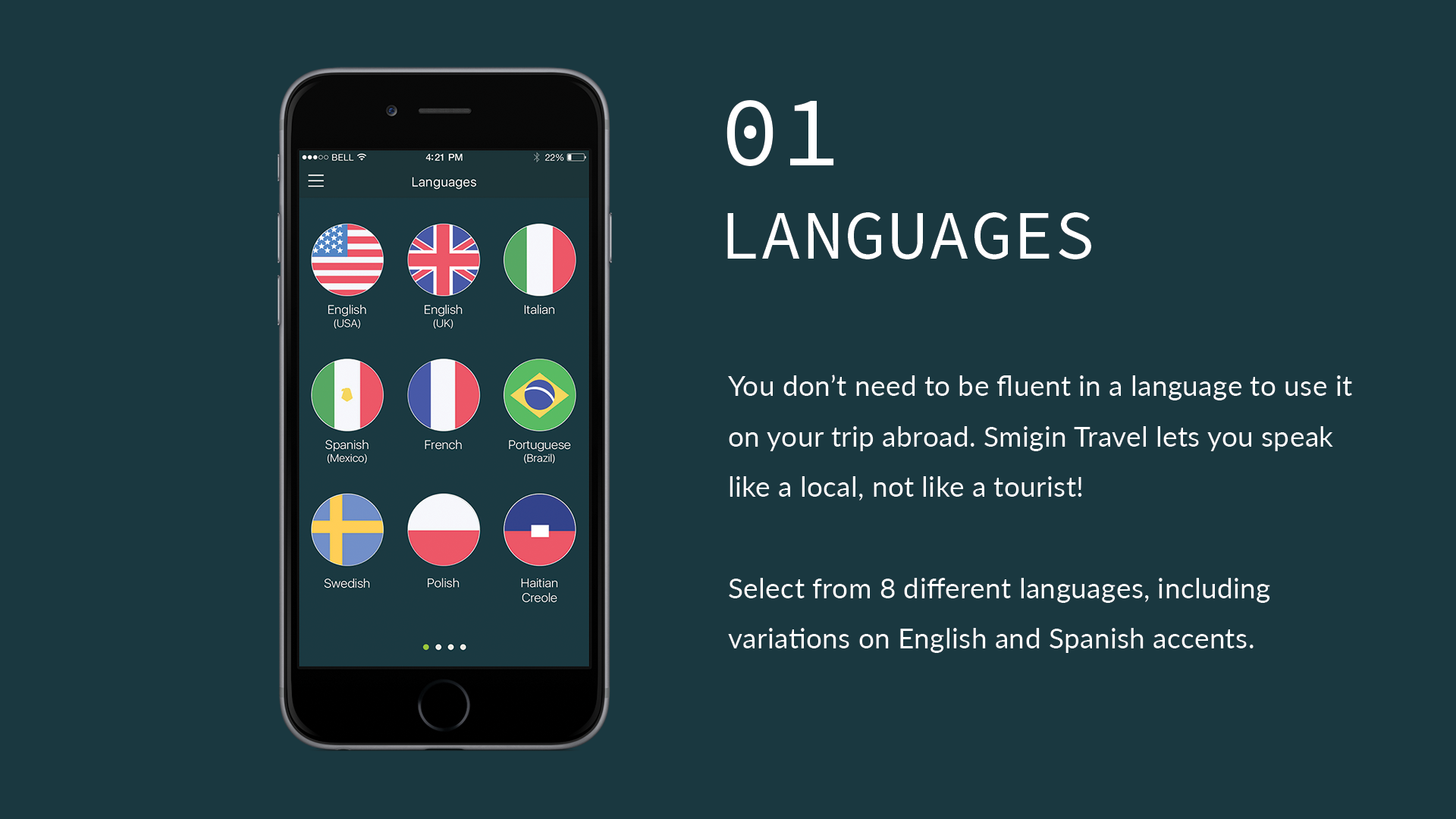
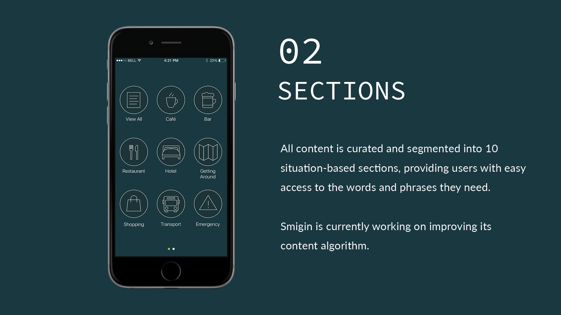
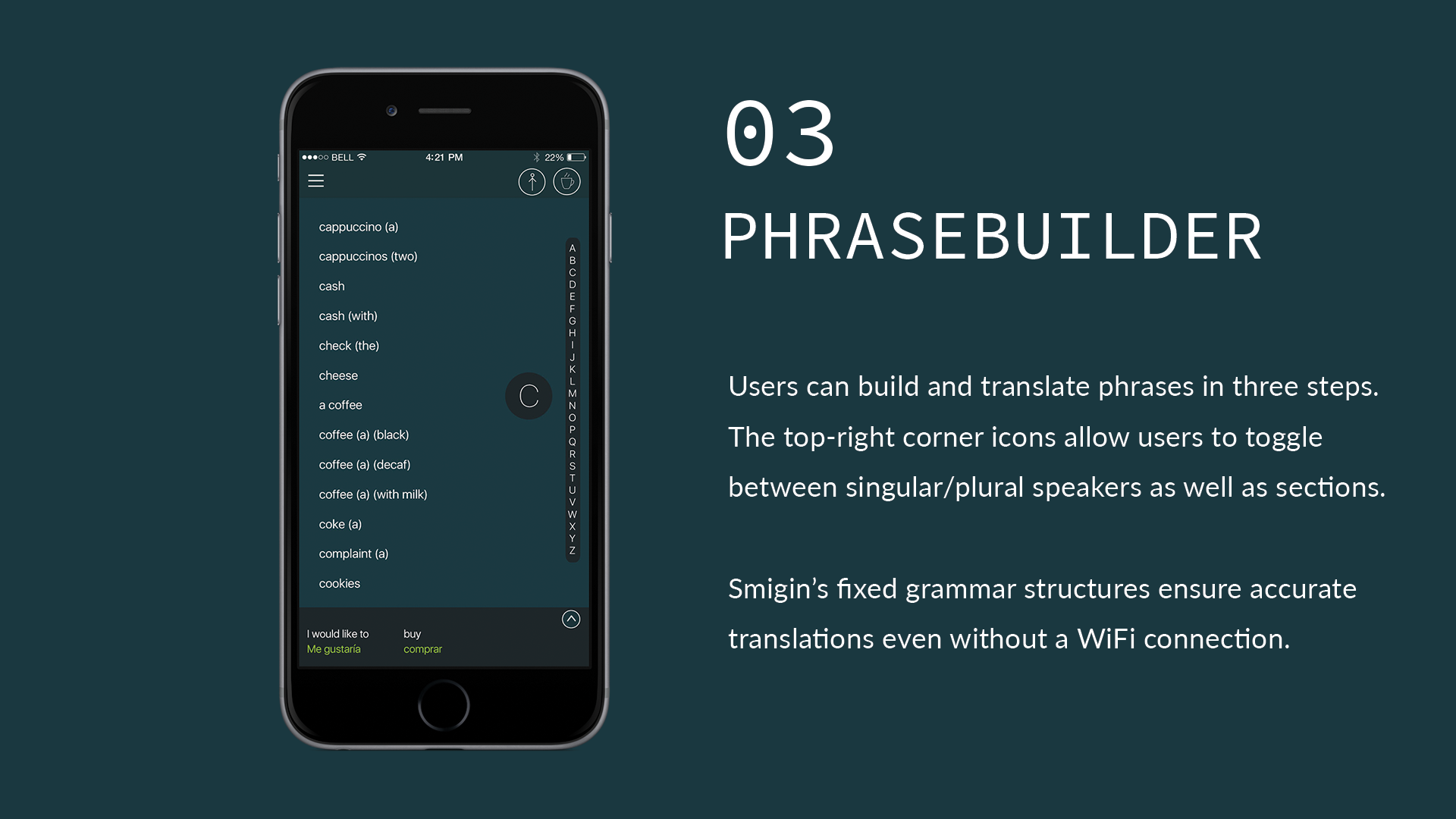
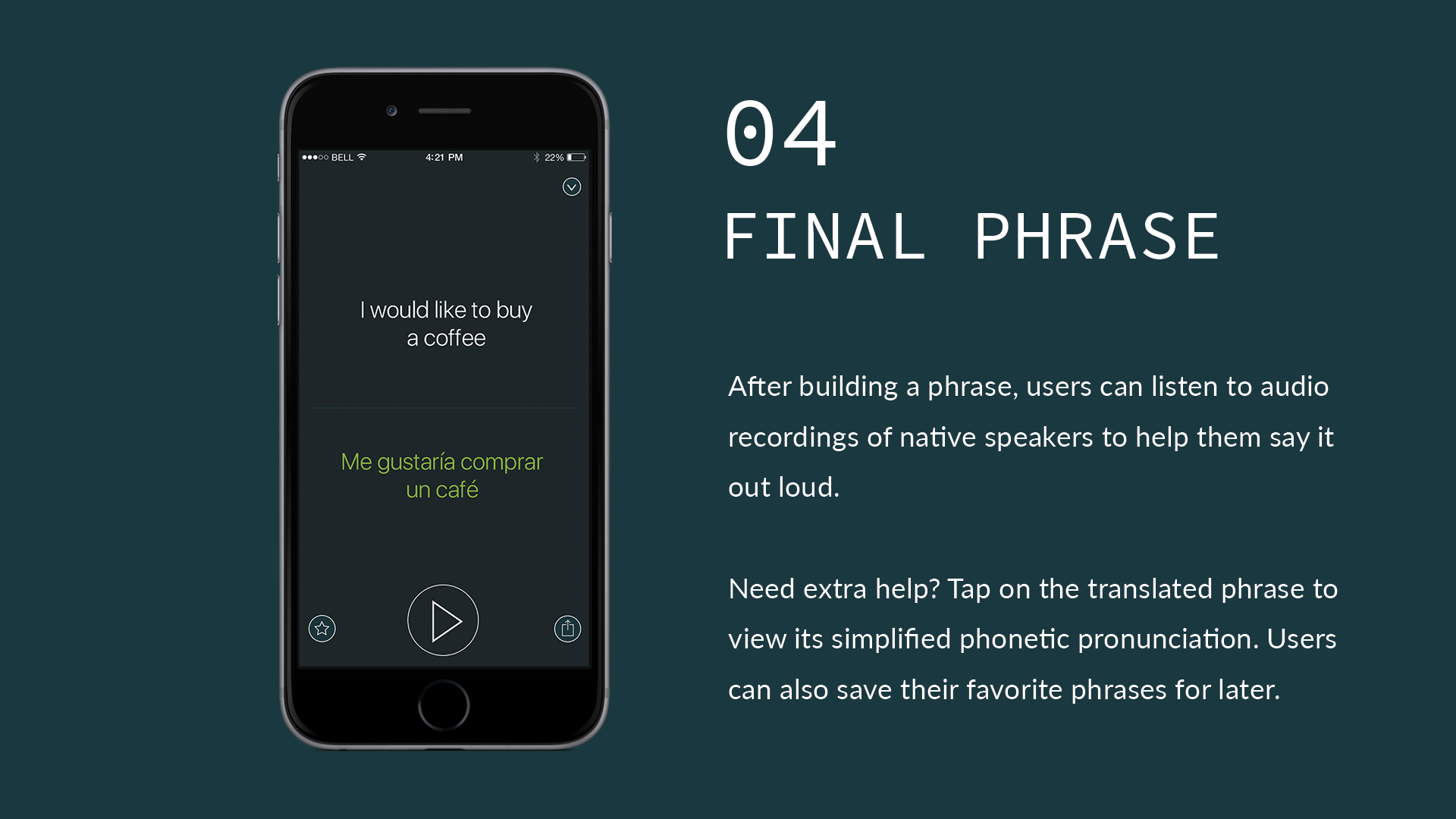
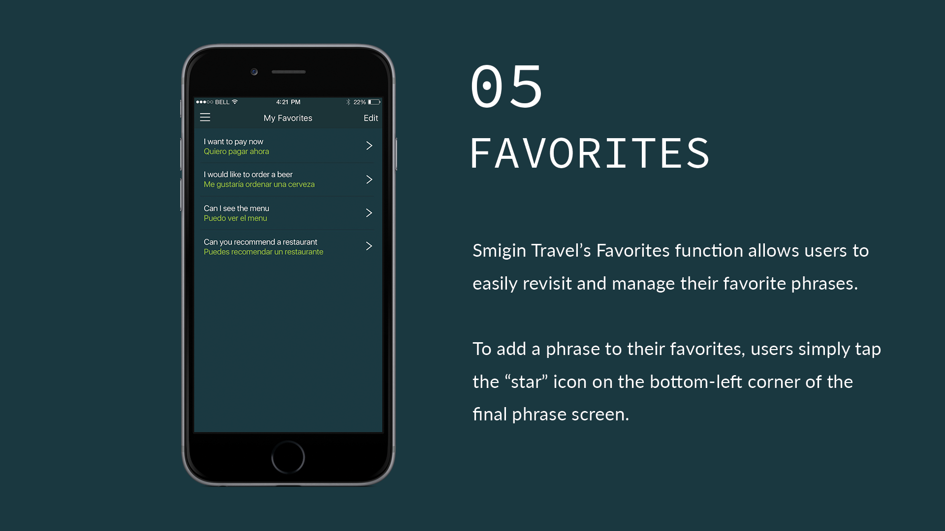
UI Snapshots
Lessons Learned
→ Research matters
Even a little research goes a long way. We iterated based on instinct, not evidence—something I’ve worked hard to unlearn.
→ Test with real users
We only tested internally. Unsurprisingly, it created blind spots. Internal testing ≠ real-world feedback.
→ Know your product’s identity
We designed for casual travelers but started pursuing enterprise white-label opportunities without adjusting the experience. Were we B2C or B2B? The answer was never clear.
→ Choose meaningful KPIs
We chased downloads and launched a second app instead of doubling down on retention and brand. I now believe we would’ve benefited from deeper investment in our core product.
•
the aftermath
• the aftermath
Smigin eventually sunset as translation tools evolved and funding challenges mounted. But the experience shaped my design thinking in lasting ways.
Two years later, I reflected on this project—and the design habits I had to unlearn—in a case study published by Prototypr:
Team Credits
Susan O’Brien: Founder & CEO, Sales
Dyllon Young: Product Management
Austin Lokre: Business Strategy, SEO
Maggie Haag: Content Management
Saoirse Giles: Content Management
Ignacio Fretes: Iconography
Vadim Belsky: Software Development
Mentorship
Nick Law: Product Design & UX
Thomas Butta: Marketing & Storytelling
Ignacio Fretes: UI Design