Heads up!
This is an outdated case study that has been minimally reformatted to fit the current site design. Expect visual inconsistencies while updates are in progress.
KindNest app
[Concept]
A kindness-focused app for New Yorkers—designed in 10 days

Type
Independent Concept Project
Timeline
10 Days
Role
End-to-End UX Designer
Tools
Sketch, Photoshop, InVision, Maze, Otter Voice Notes
Responsibilities
Competitive Research
User Interviews & Persona Creation
User Flows
Mid- to High-Fidelity Wireframes
Clickable Prototype
Remote Usability Testing
Overview
Over the 2018 winter holidays, I challenged myself to design an iOS app that centered around one theme: kindness. I gave myself 10 days to ideate, prototype, and test a product that could make city life just a little more generous.
The result was Kindnest—a concept for a mobile platform where New Yorkers could donate skills or services to neighbors in need. Whether that meant helping someone move, tutoring a local teen, or just being present, the goal was to encourage real-world kindness between people who share a zip code but not necessarily a social circle.

The Concept
After an initial brainstorm around what “kindness” could look like in an urban setting, I narrowed the idea down to two concepts:
A food donation app that helps restaurants share leftovers {Similar to: Goodr, Re-Plate, Rescuing Leftover Cuisine, Seamless}
A neighbor-to-neighbor platform for sharing time, skills, or services {Similar to: Catchafire, Care.com, Fiverr, TaskRabbit}
I chose the second.
Kindnest would help users like Michelle—New Yorkers with big hearts but tight budgets—get help from verified locals willing to lend a hand. Think: the generosity of a mutual aid group, wrapped in the usability of TaskRabbit.

Hypothesis
Designing a platform that matches willing individuals with neighbors in need will encourage city dwellers to be kinder to one another.
Research & Discovery
Persona
Michelle Reyes, 26
Queer Afro-Latina, full-time restaurant worker
She’s emotionally generous but physically exhausted. She wants to help others—and feel safe asking for help herself.
“I will go above and beyond for someone I care about…”
— Dave, 25, Store Manager
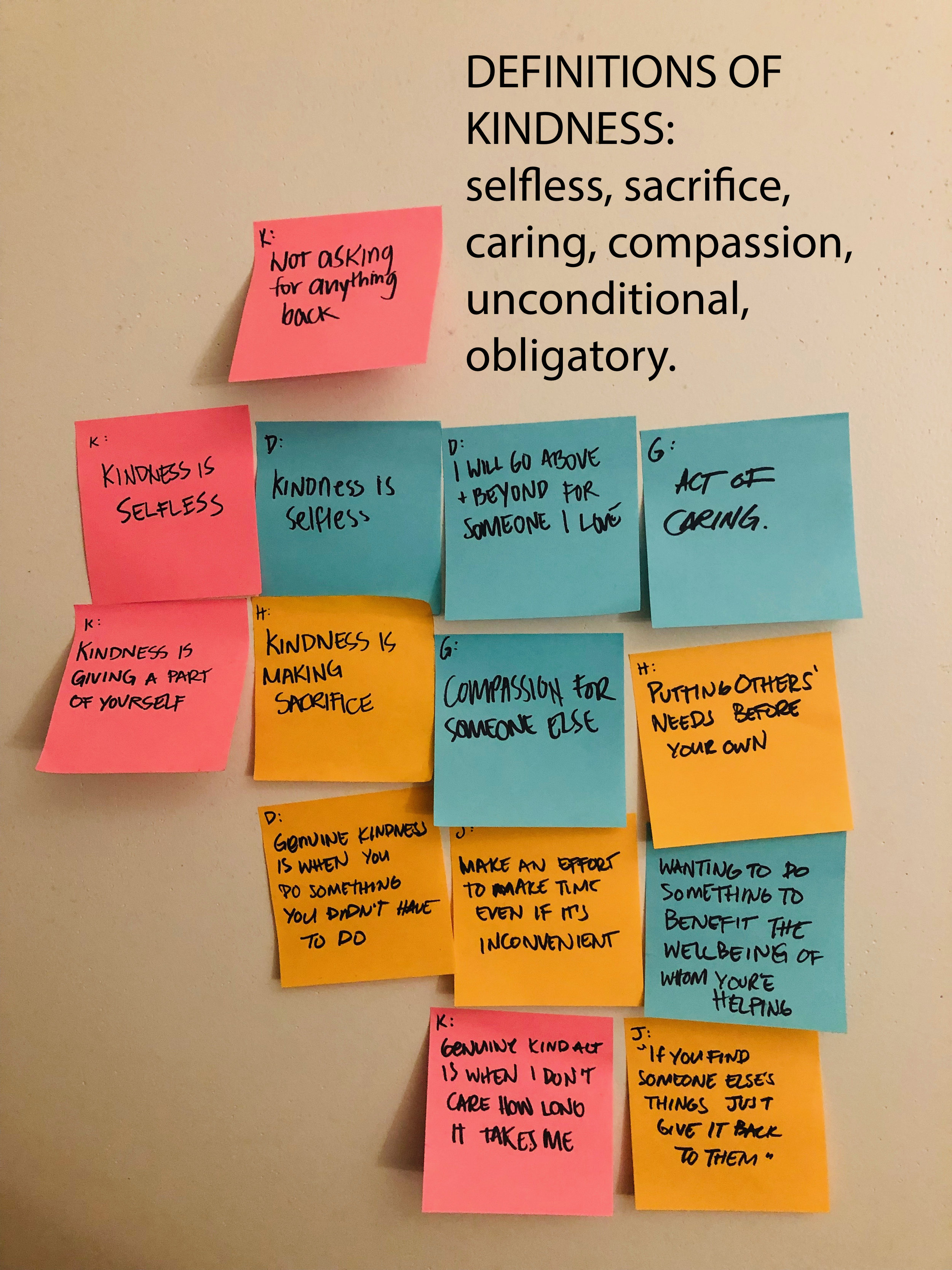
User Research
To explore how people think about kindness, I conducted five interviews with city dwellers (four aged 25–35, one over 50) living in New York and Boston.
Sample Questions included:
How would you define “kindness”?
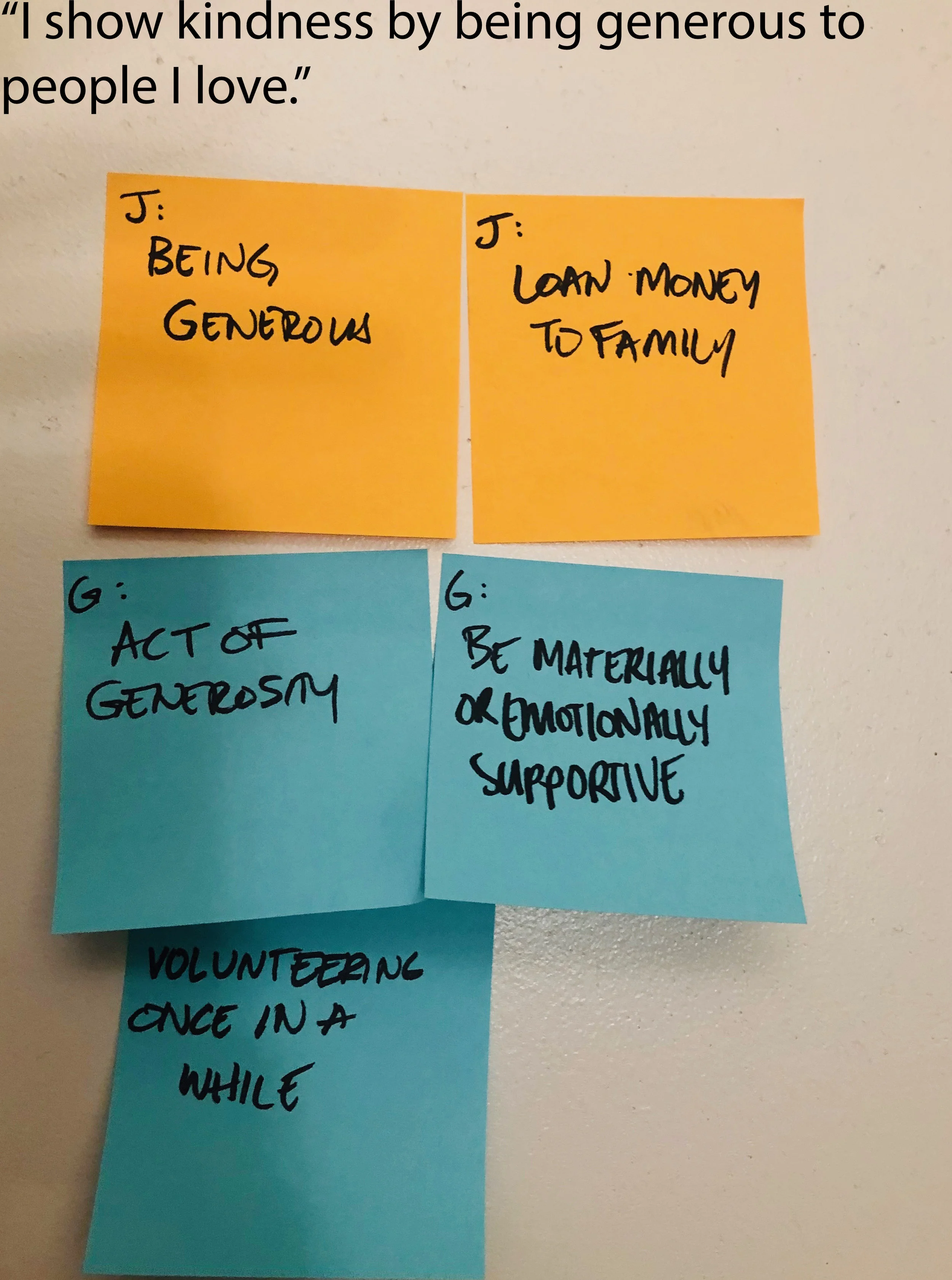
How do you show kindness to your family? Your friends? Your peers? Your neighbors?
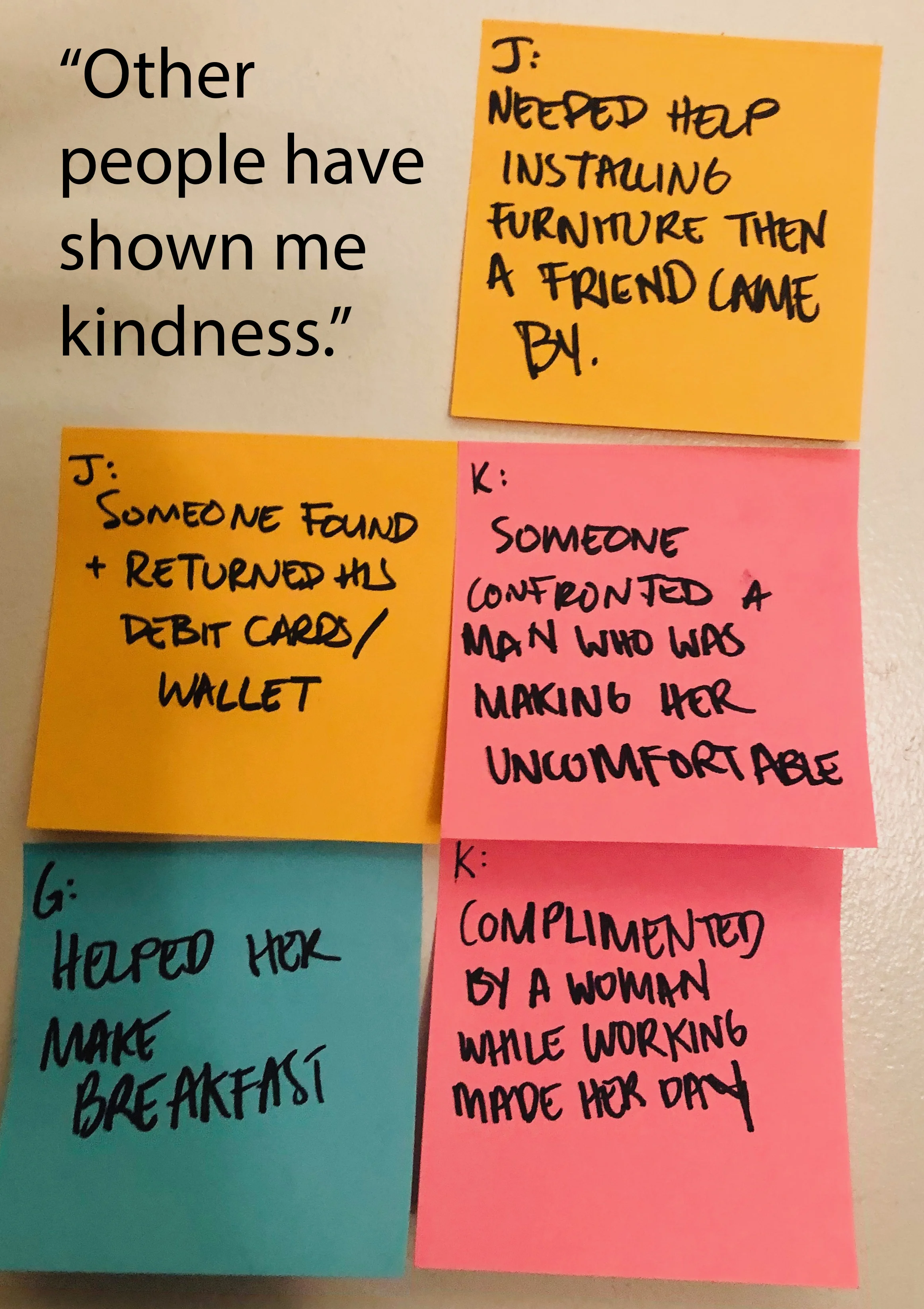
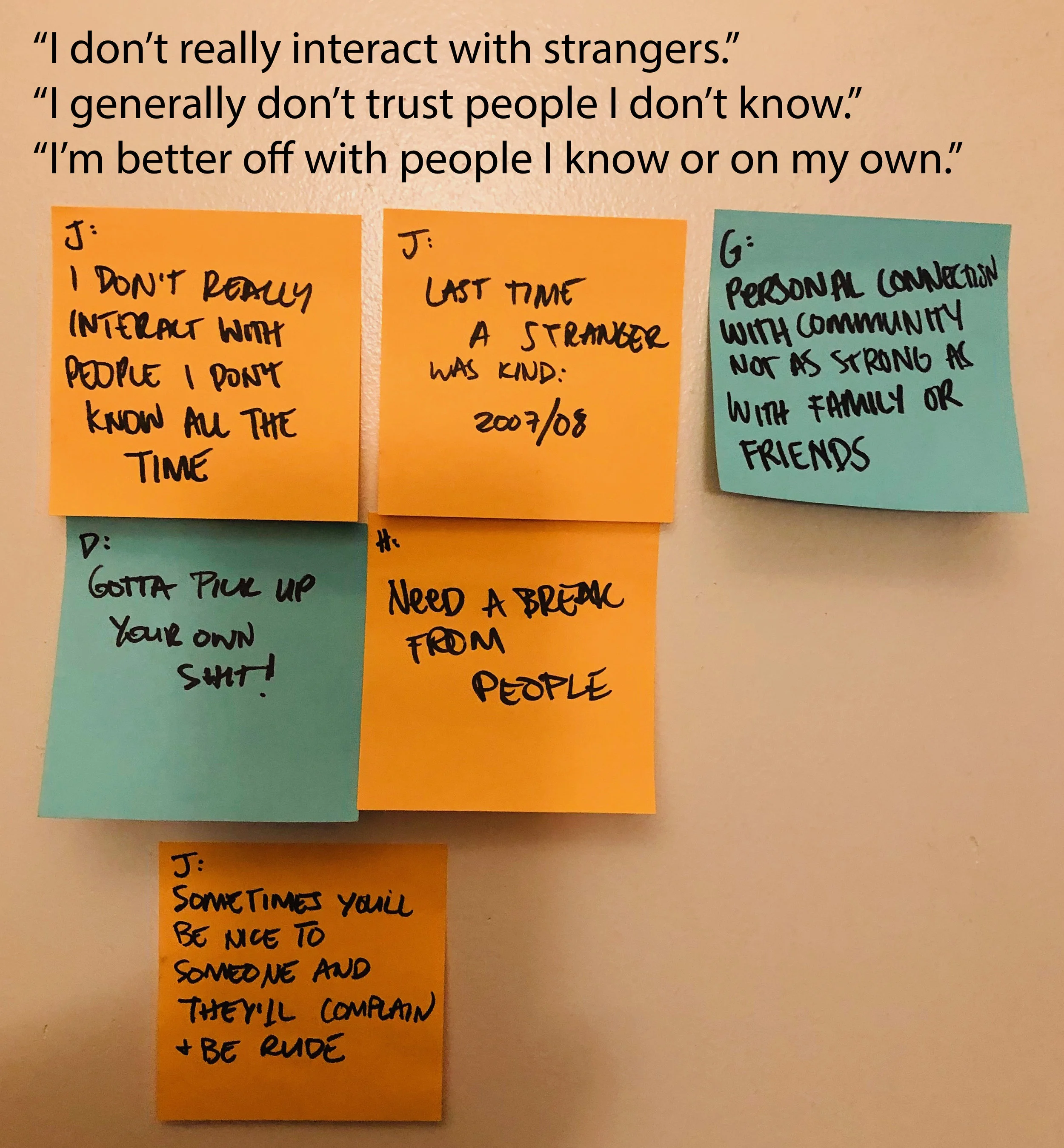
Tell me about the last time someone you don’t know was kind to you.
Tell me about the last time you were kind to someone you know. Why did you do it?
Tell me about the last time you were kind to someone you don’t know. Why did you do it?
Tell me about a time when kindness was difficult for you. Why was that?
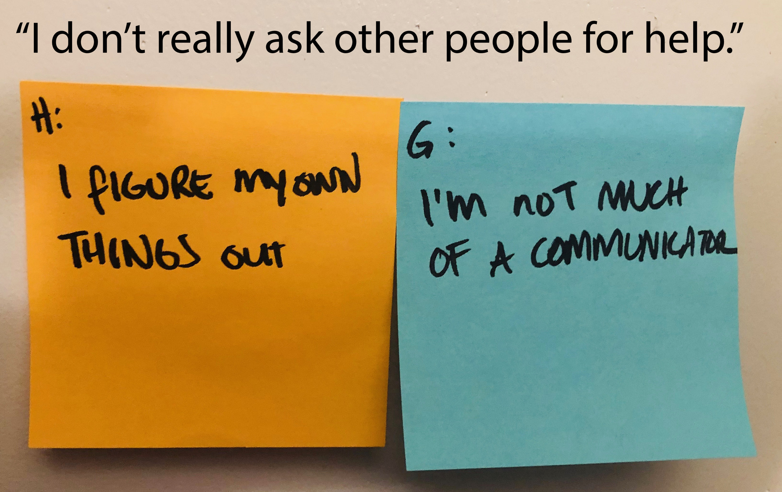
When was the last time you needed help with something? How did you get help? What happened as a result?
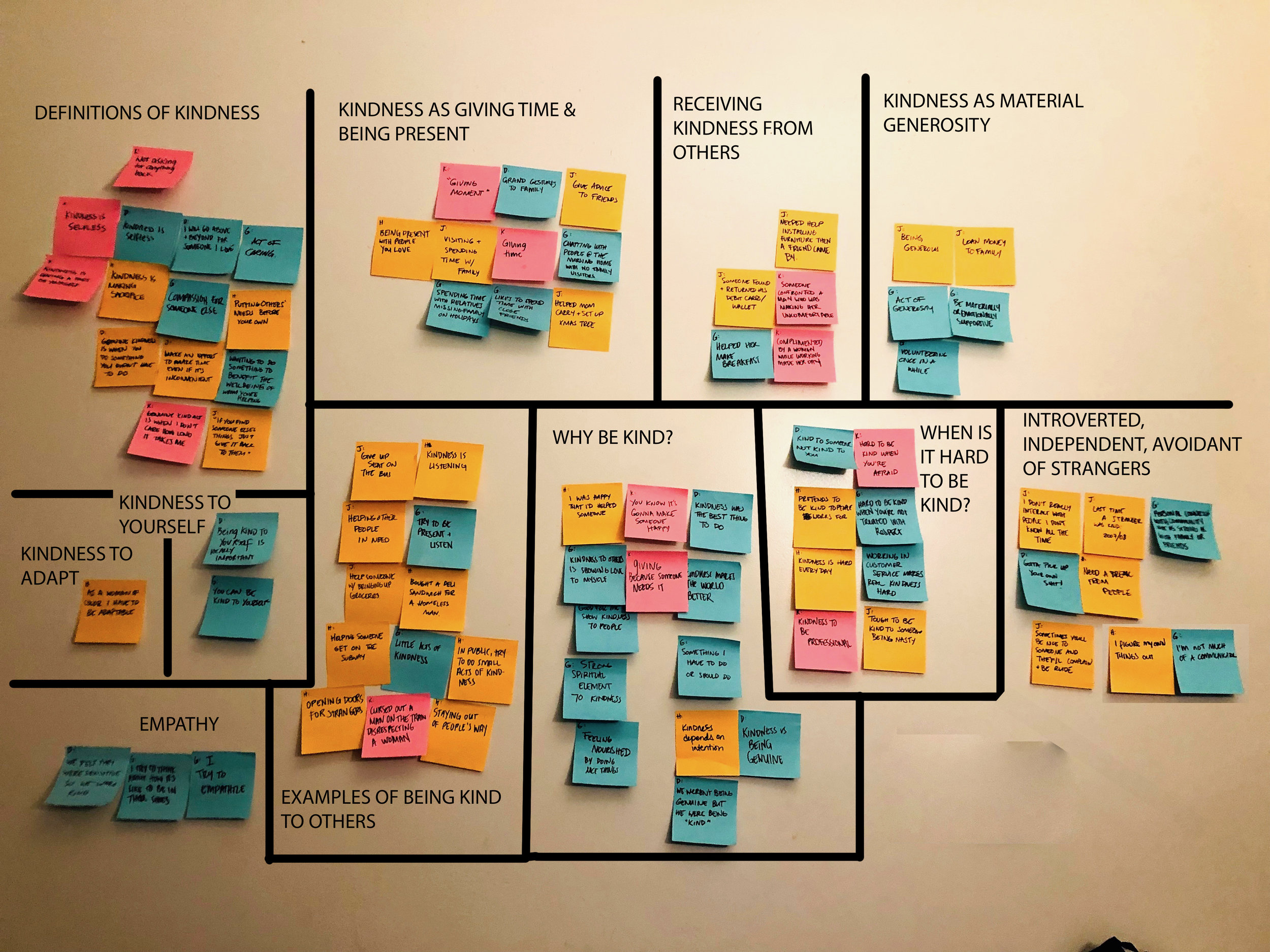
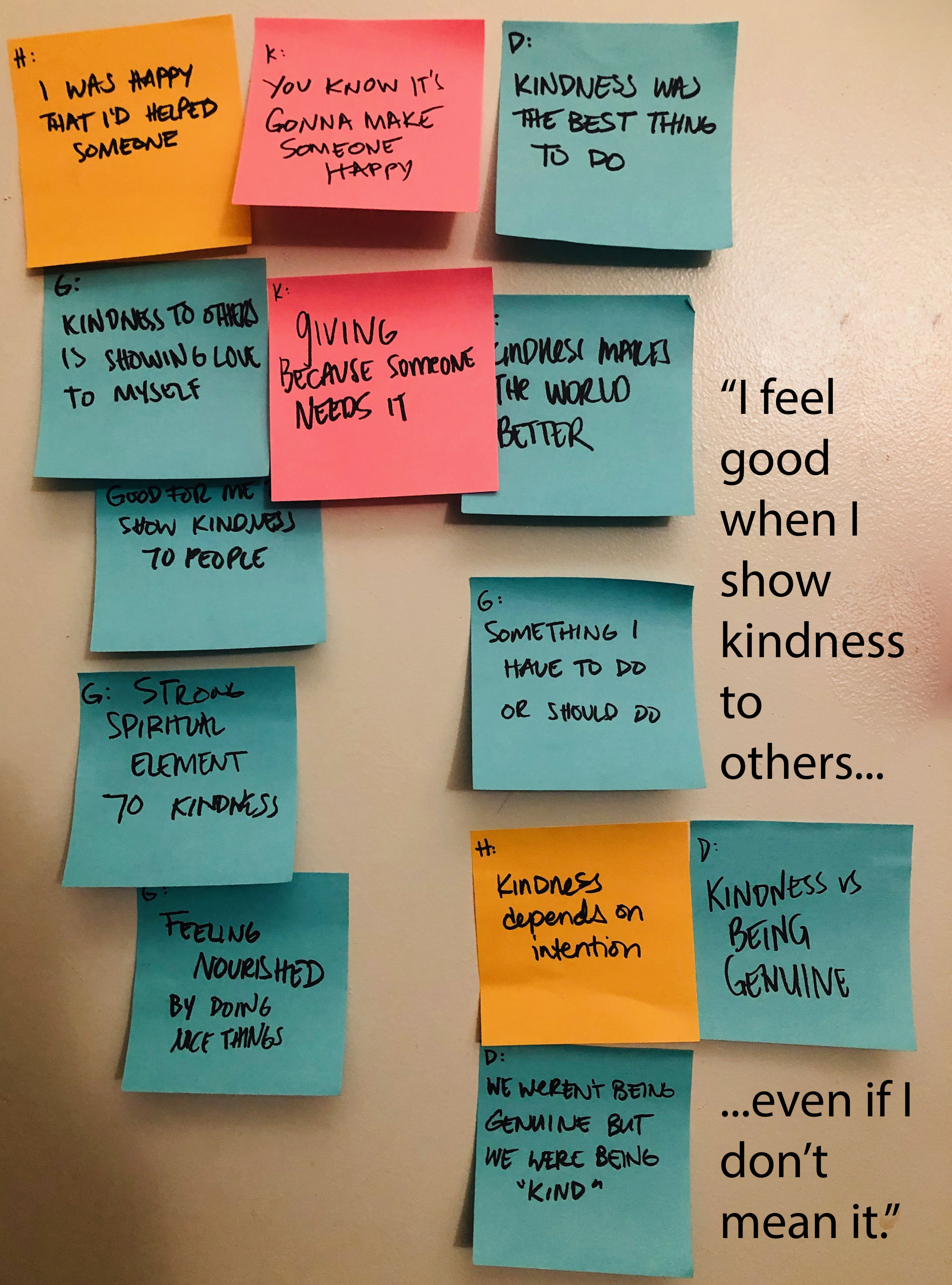
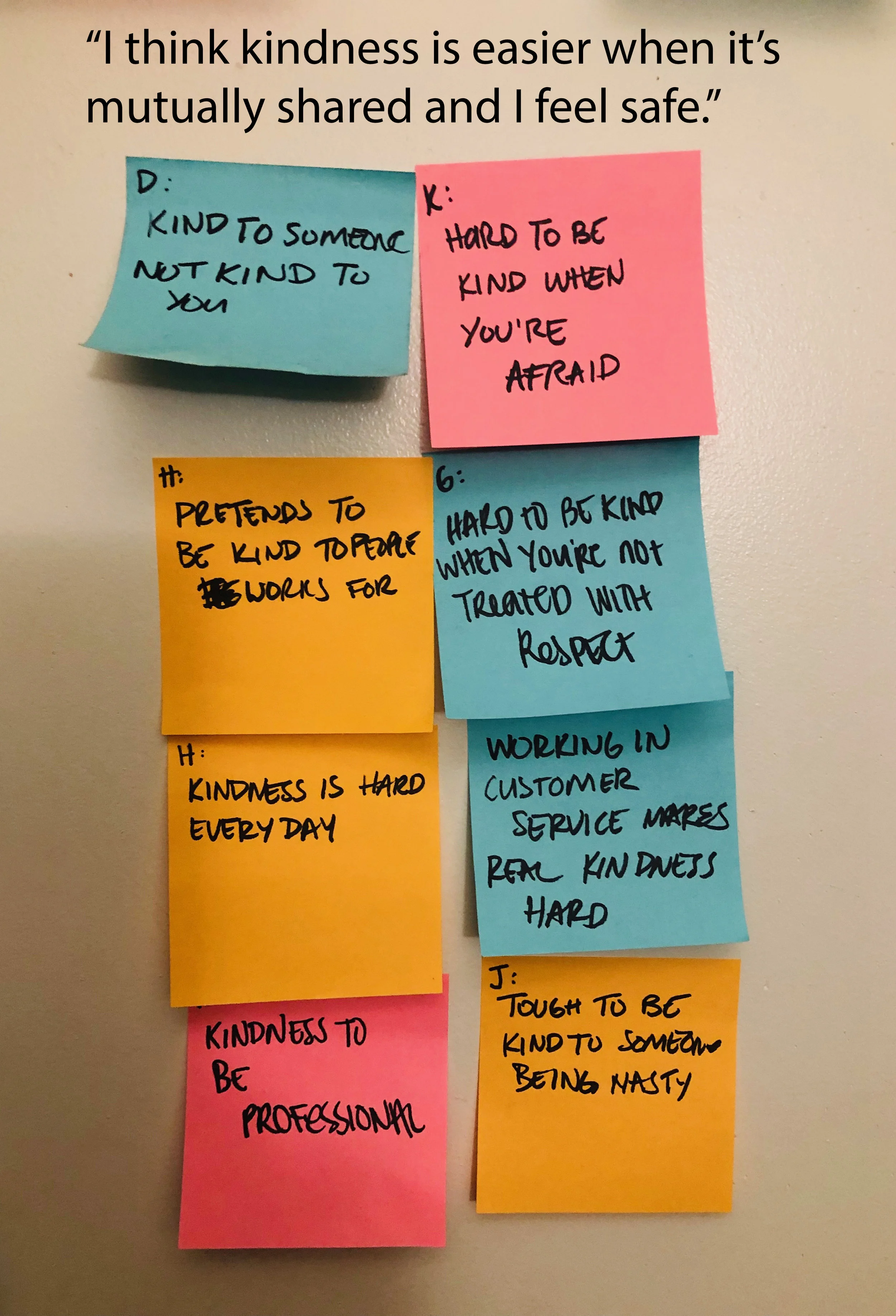
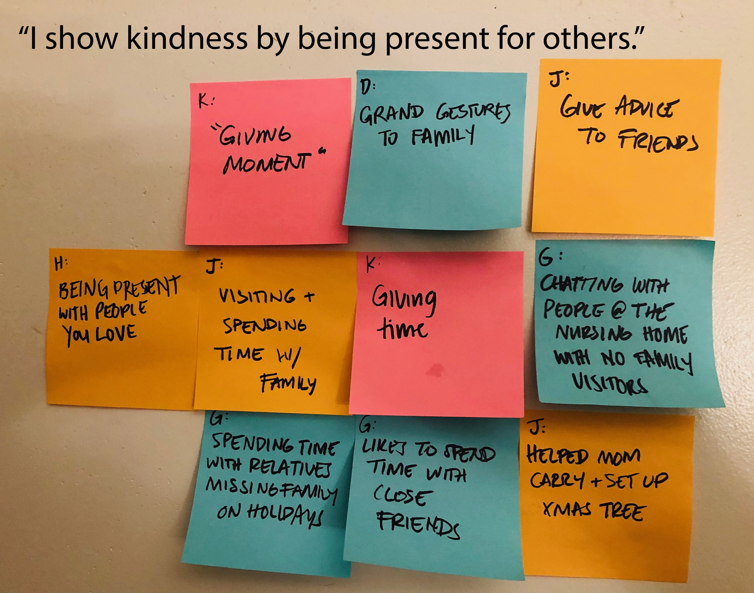
Key insights from affinity mapping:
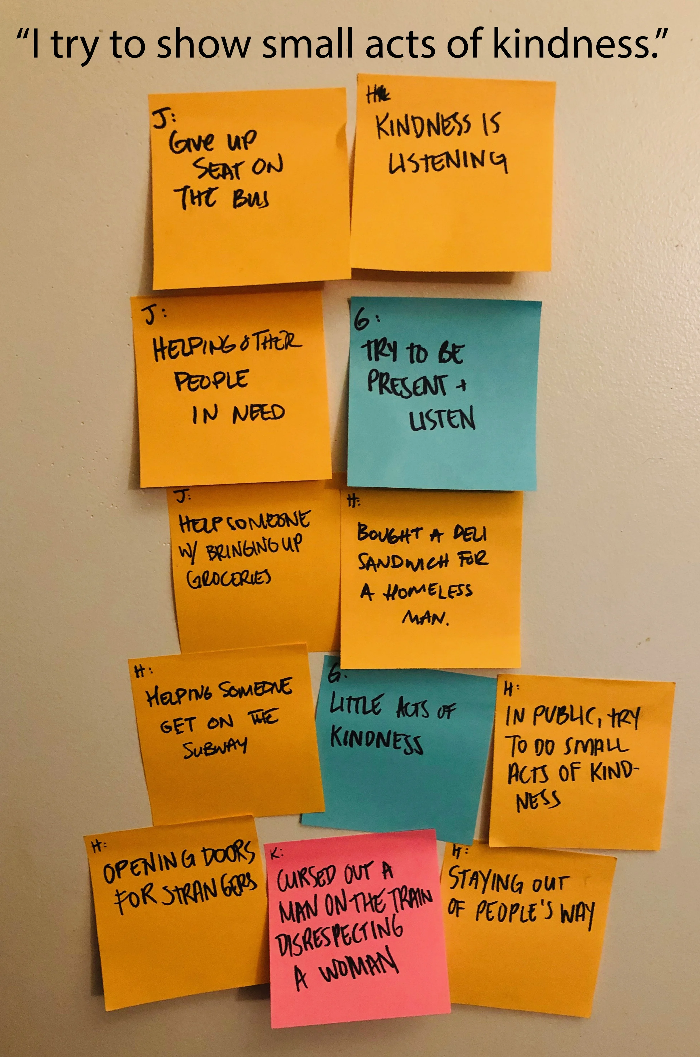
“I show kindness by being present for others.”
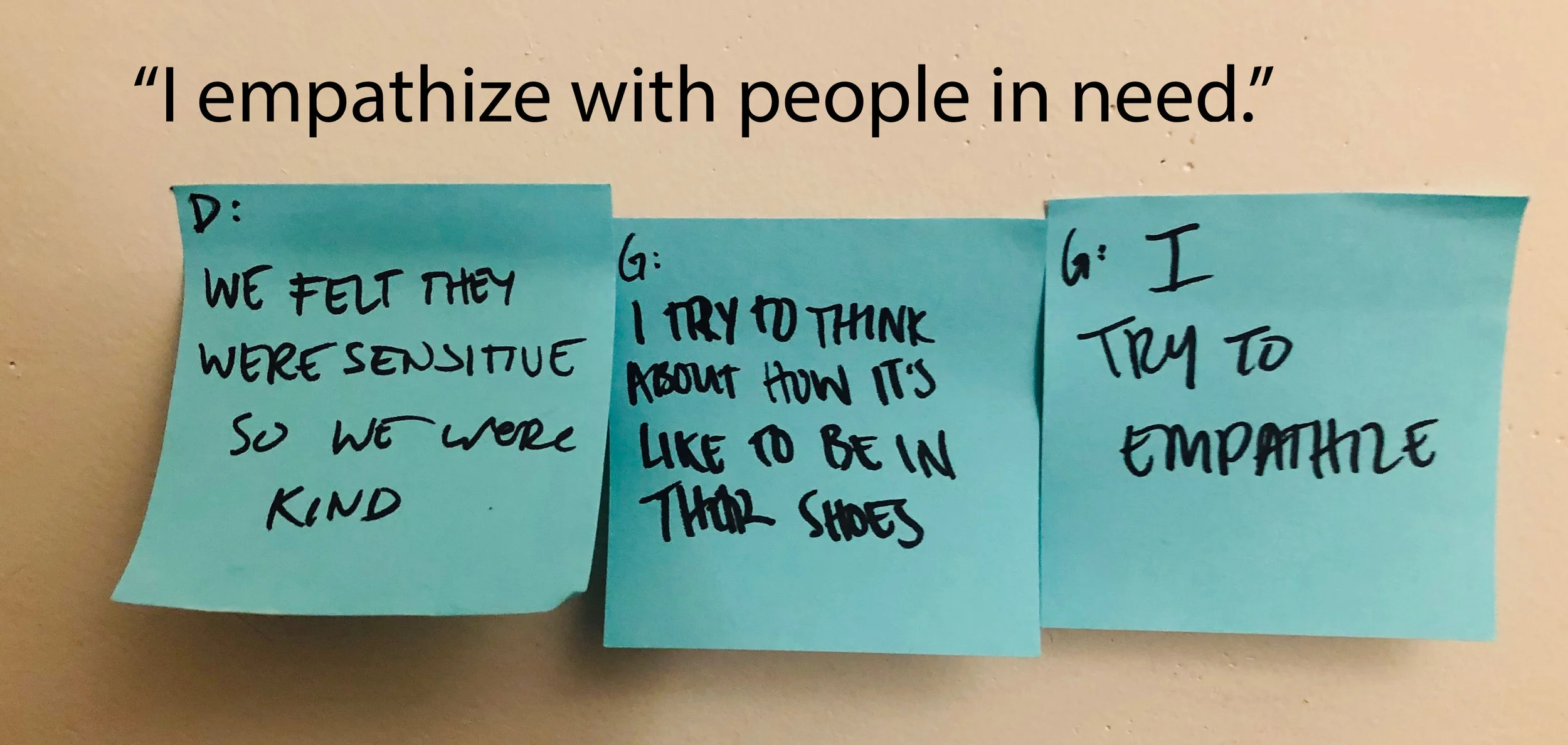
“I empathize with people in need, but I don’t always trust strangers.”
“Kindness feels safer when it’s mutual.”

Design Goals
How might we…
Help Michelle find trustworthy neighbors who can help her move?
Empower her to feel safe both asking for and offering help?
Encourage her to return the favor and keep using the app?
Paper Sketches
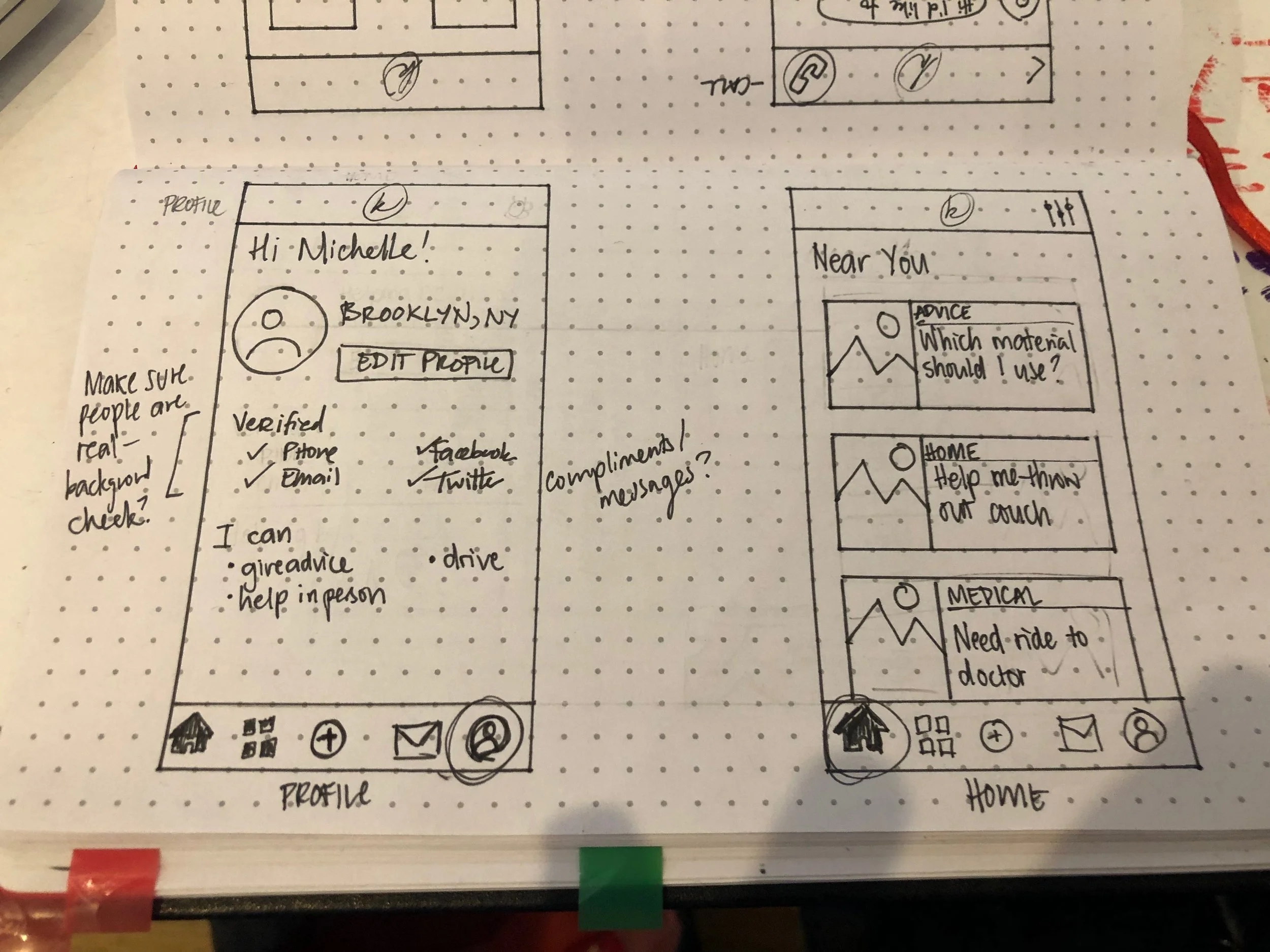
01 Profile page and Home feed. Profile page shows different types of verification to minimize fraudulent users. The app’s home page is a feed of neighbors asking for help.
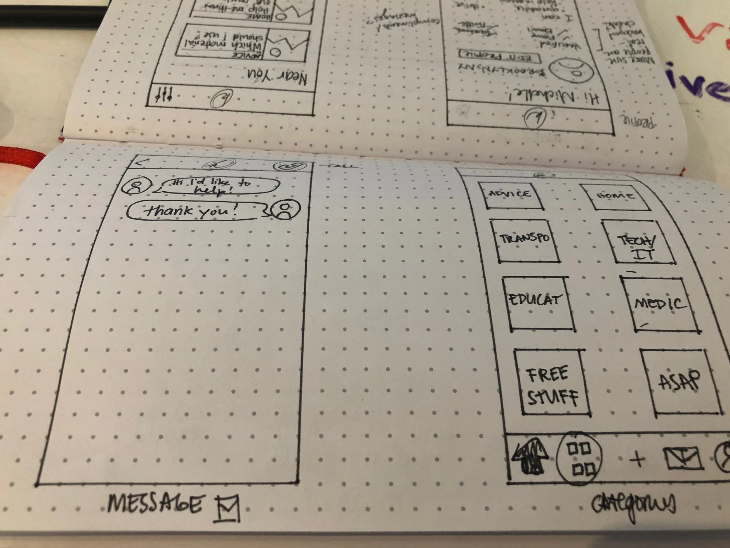
02 Messaging and Categories. A “Discovery” tab replaces the Categories tab in the wireframes and prototype.
User Flows (Best Case)
I designed flows for key use cases:
Create an account
Add a help request
Respond to a neighbor
Close a fulfilled request
Return the favor
I built a clickable prototype in InVision using mid-to-high fidelity wireframes.

Usability Testing
I ran remote testing with 6 users through Maze, assigning 5 tasks based on the flows above. While success rates were technically 100%, deeper analysis revealed pain points in tasks 3 and 4.
Feedback highlights:
“Very easy to use.”
“Intuitive setup.”
“Looks good and functions well.”
But…
Tasks involving getting help from others had higher error rates—likely tied to trust and UI clarity.
What I’d Explore Next
Revisit the Discovery tab: Is it solving a real problem or adding noise?
Reduce error rates: What tripped users up in tasks 3–4?
Build trust: How can design foster emotional safety in a transactional city?
Think beyond NYC: Would this app work better in places with stronger communal culture?
Compete with paid platforms: Why give time when you could get paid on TaskRabbit or Fiverr?
Kindness is aspirational—but design has to ground it in real-world behavior. With Kindnest, I tried to do both.

Usability Testing Success Rates. Though all tasks had “100% success,” Tasks 3–4 yielded high rates of user error.